
Pear
Convincing brands to buy the jerseys.
Pear had a great pitch. Your rec league, robotics club, or PTA gets free custom shirts, and a brand gets its logo on the front. My job was to make both sides believe it. For two years I designed just about everything that carried the Pear name, from pitch decks to a scoreboard in Indianapolis to the walls of our own office.
See the workFree shirts, with a catch everyone liked
Pear started in Chicago as a side bet from Custom Ink. Groups need gear. Brands want to show up in their communities in a way that feels real, not like another banner ad. Pear put the two together: the brand pays for the shirts, the group wears the logo, and everybody wins.
The tricky part was the audience. On Monday I'd be designing a deck for a marketing director at a national brand. On Tuesday it was a flyer for a youth soccer coach who had about ten seconds between drills. Same company, same orange, two completely different conversations. Keeping those in one voice was the whole job.
A startup with a big sibling
Pear was new, but Custom Ink wasn't. That helped and hurt. Sponsors trusted the name behind it, but Pear still had to feel like its own thing: friendly enough for a Little League dugout, polished enough for a boardroom.
Sources: customink.com · Built In Chicago · Revolution Growth
Twelve projects, two audiences
Filter by who it was for, or just keep scrolling. Click any image to see it full screen.
Break through the noise
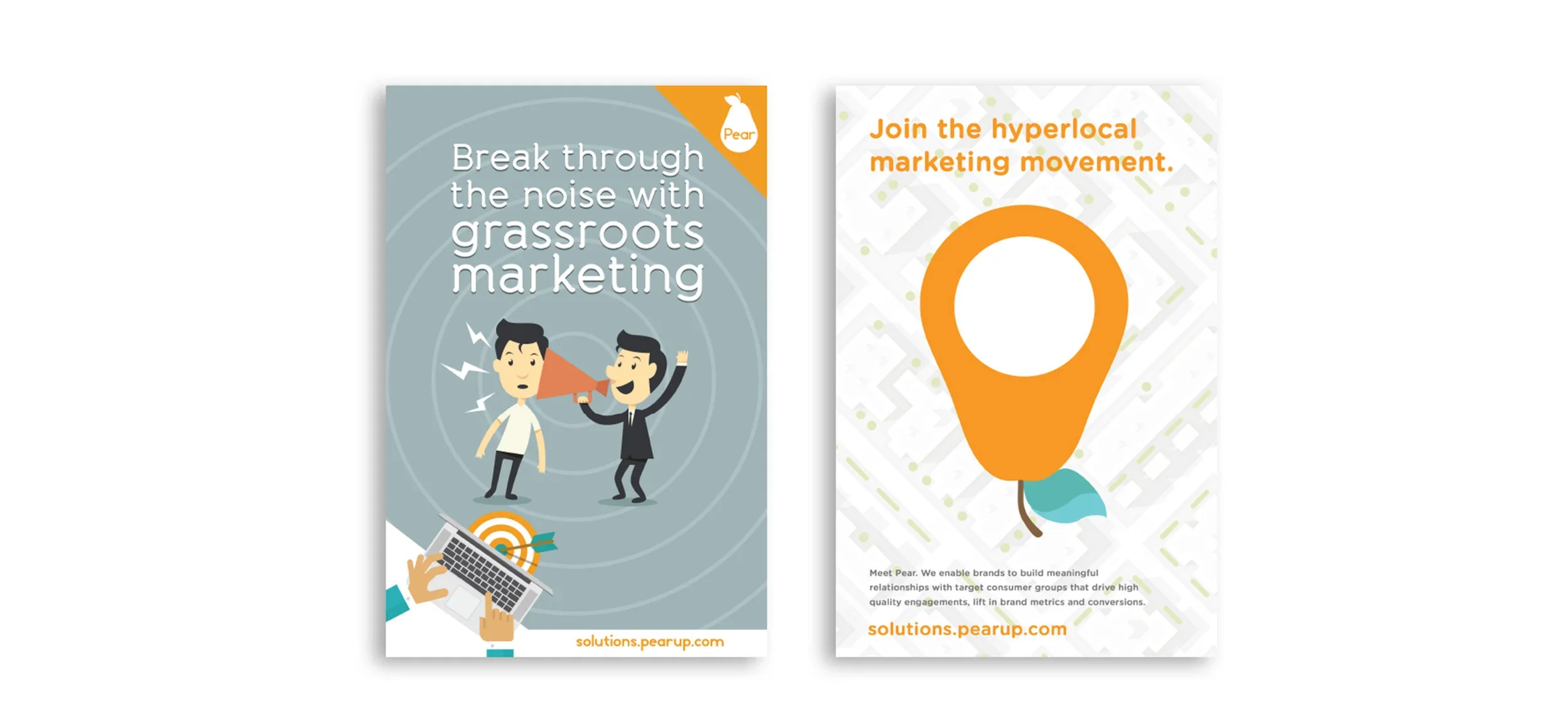
Marketing managers get pitched all day. These leave-behinds had to explain Pear in about five seconds: local, grassroots, and easy to measure. Big type, one idea per page, and plenty of orange so they'd stand out on a cluttered desk.
The pitch deck
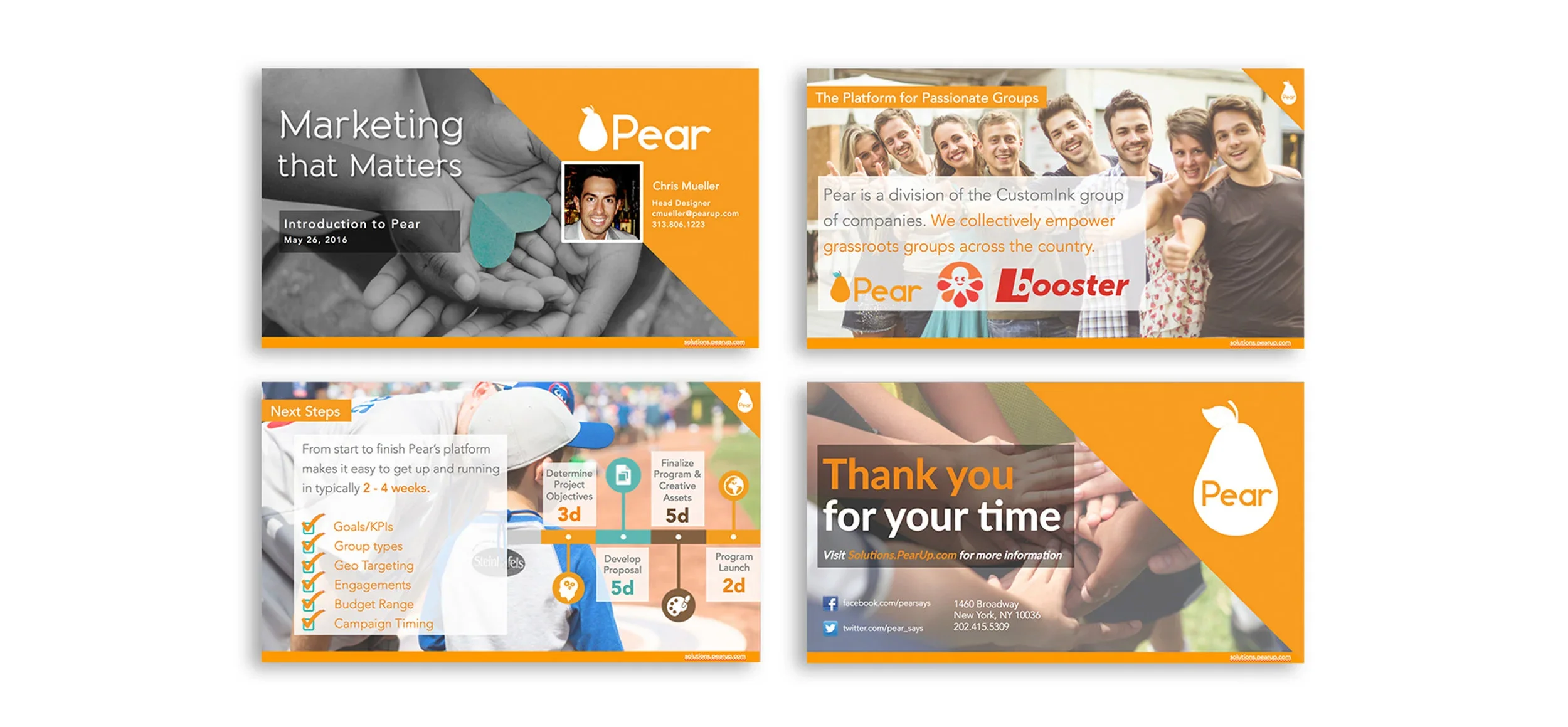
A deck template the sales team could pull apart and rebuild for every meeting. It leads with the people a brand would actually reach, shows real partners next, and closes on a thank-you slide worth remembering. Easy to customize, hard to make ugly.
The quarter sheet
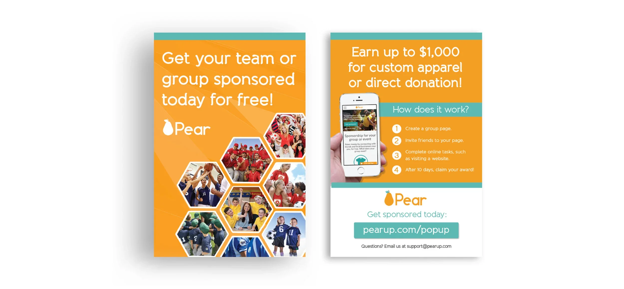
The workhorse. Coaches and club leaders passed these out at practices, events, and school pickups. The front makes the offer, up to $1,000 and free to join. The back explains how it works in a few quick steps. Anything that needed a second read got cut.
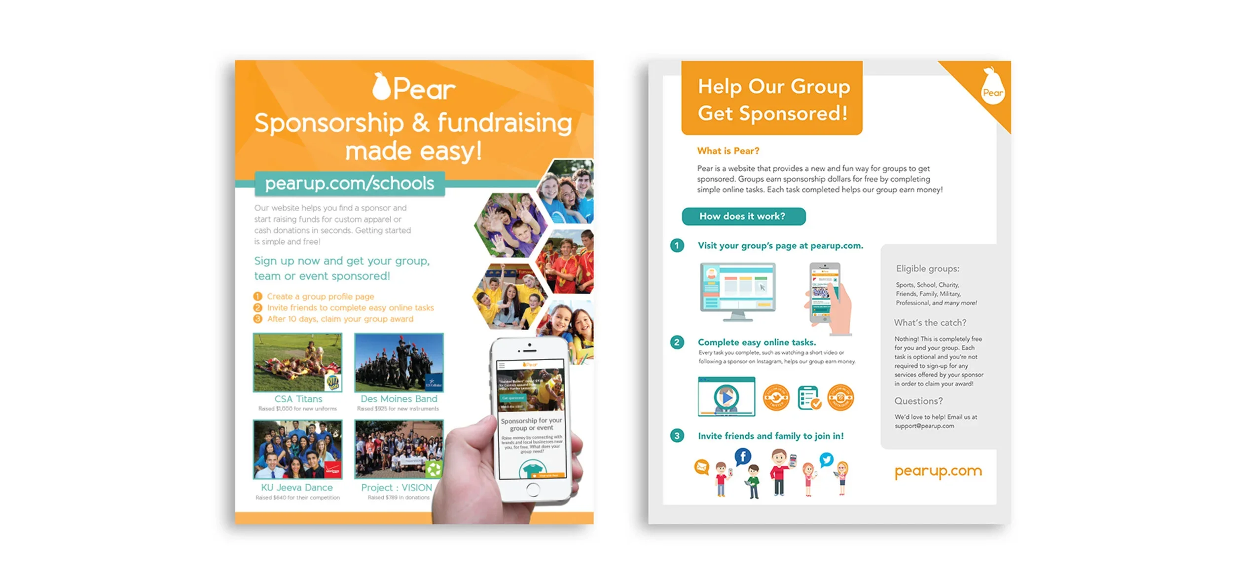
Schools flyer and user guide
Signing up was only half of it. Somebody still had to rally the parents. This guide walks a first-time team captain through setting up a page, sharing it, and getting funded, no marketing background needed.
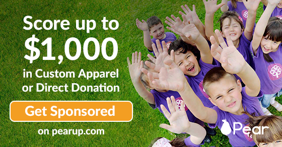

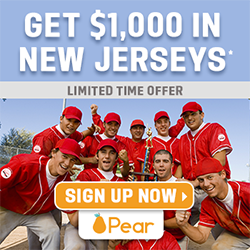
Actual size. Real dollars up front, a big button, and the sponsor right in the headline.
Banner ad system
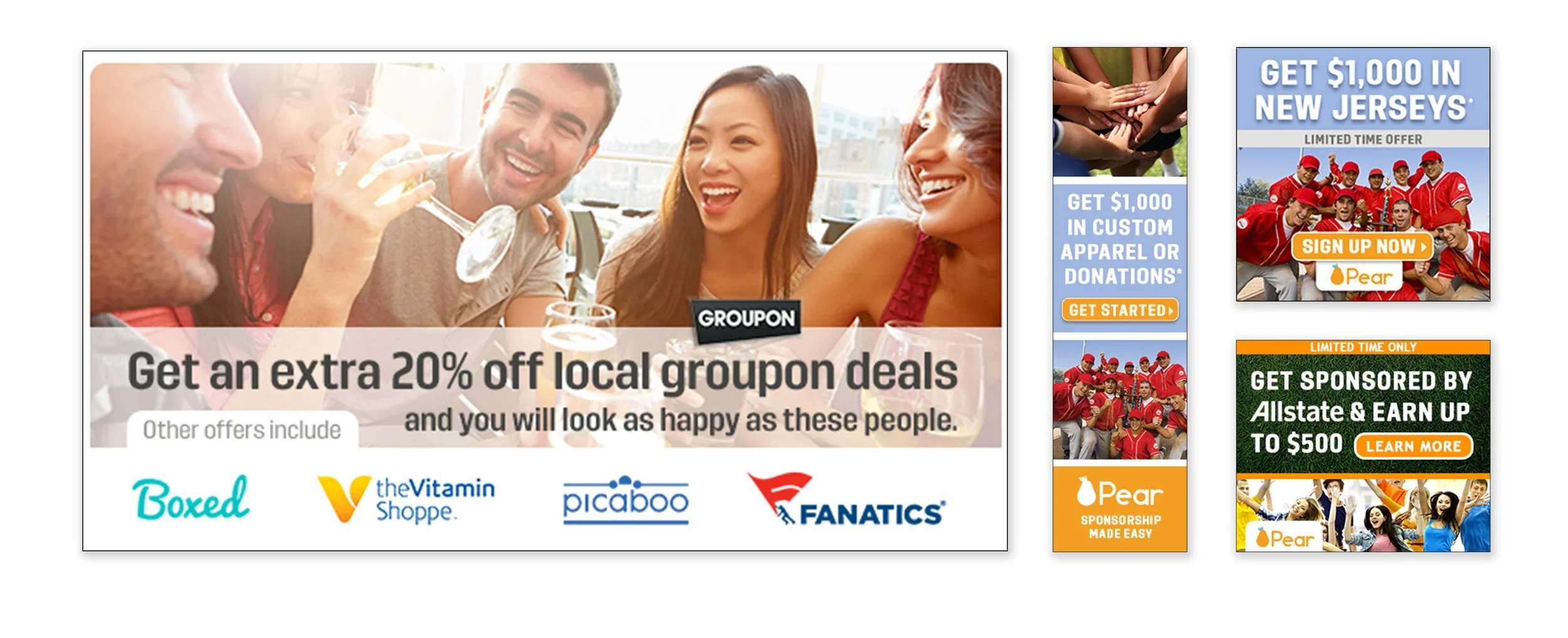
One layout that stretched across every standard ad size, plus co-branded versions with partners like Groupon and Allstate. The formula was simple on purpose: a dollar amount, a clear ask, and real people having a good time.
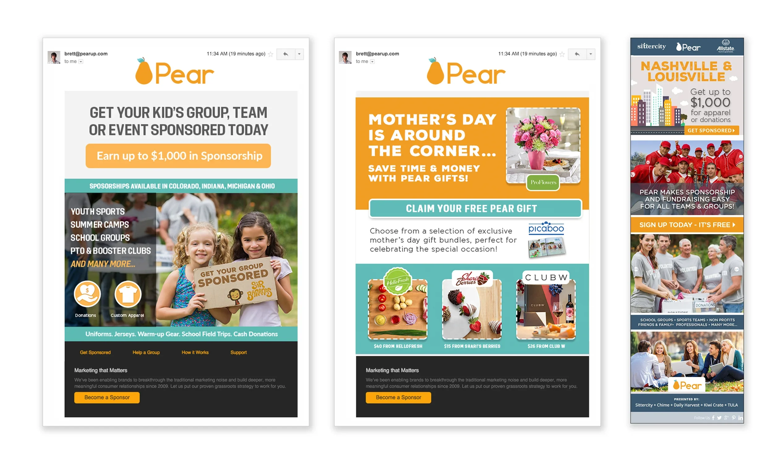
Email blasts
Seasonal and city-by-city emails kept new groups coming in: back-to-school recruiting, a Mother's Day push, launches in Nashville and Louisville. Same building blocks every time, a fresh story with every send.
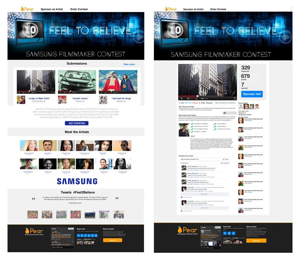
Samsung filmmaker contest
Sometimes a sponsor wanted more than a logo on a shirt. For Samsung, Pear ran a filmmaker contest, and I designed the pages for it: a gallery of entries up front and a page for each film. Samsung's look and Pear's had to share the screen without fighting.
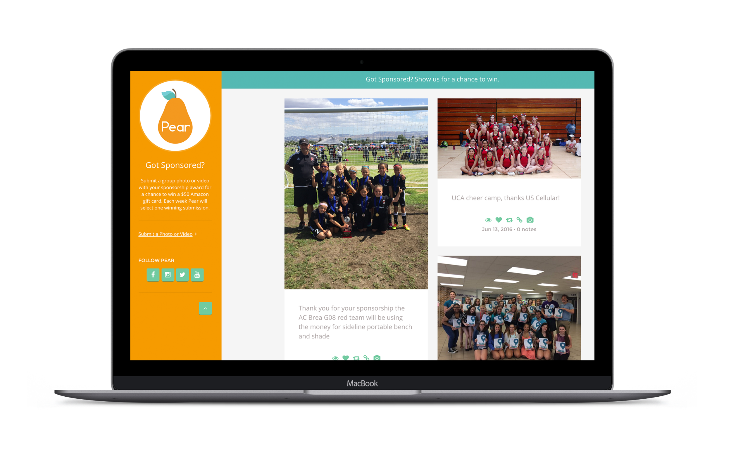
Facebook page
The best ads we had were photos of real teams in their new shirts. Pear's Facebook page was built around exactly that, with a bright sidebar that pointed every visitor to one thing: get sponsored.
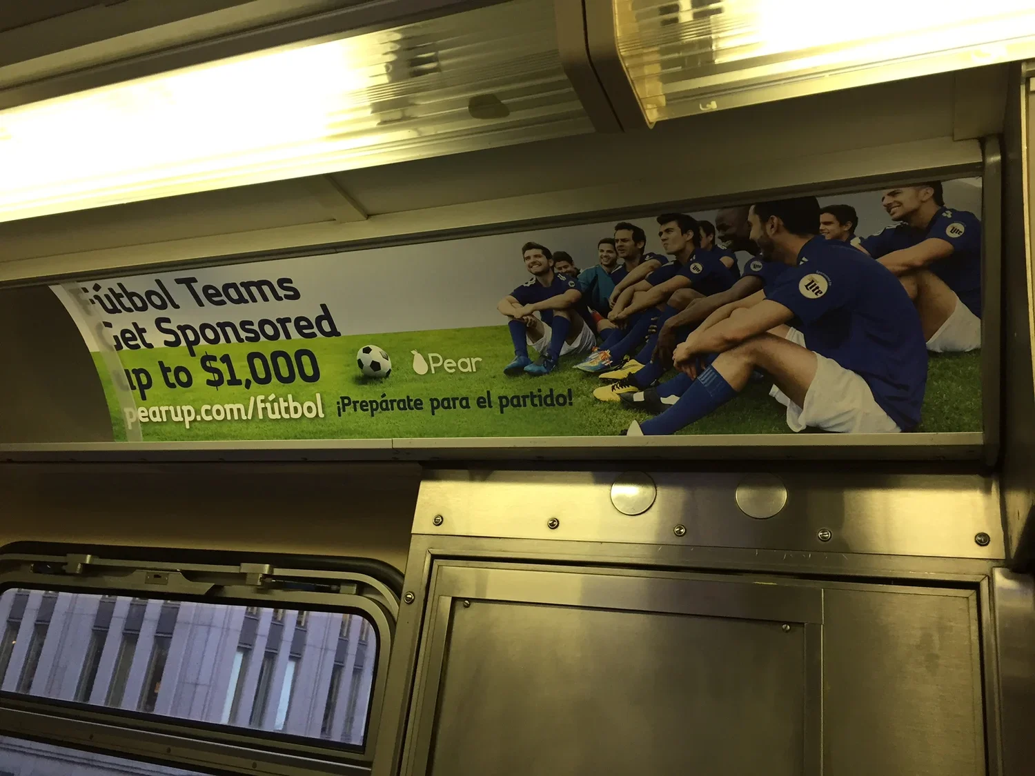
Chicago train ad
A Spanish-language card riding Chicago's trains, speaking straight to the city's soccer teams. Talking to a community in its own language did more work than any clever headline could have.
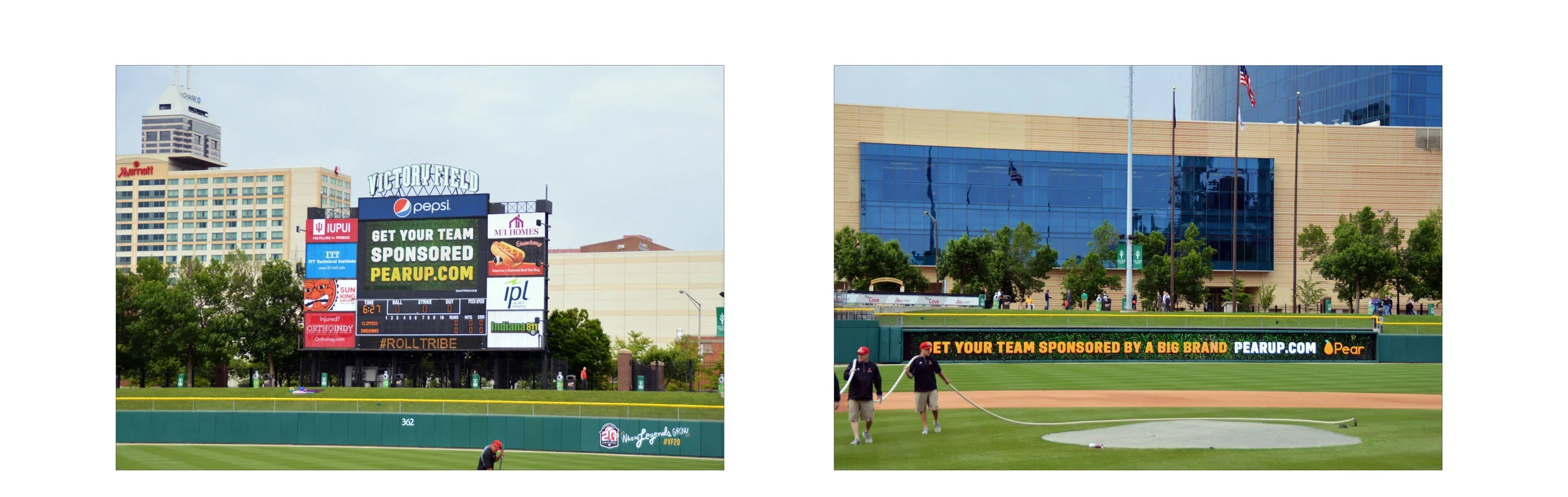
Indianapolis Indians scoreboard
Pear on the big screen and the outfield wall. Designing something people read from the upper deck, mid-inning, with a hot dog in hand, is a great lesson in using fewer words.
The booth and the ballpark
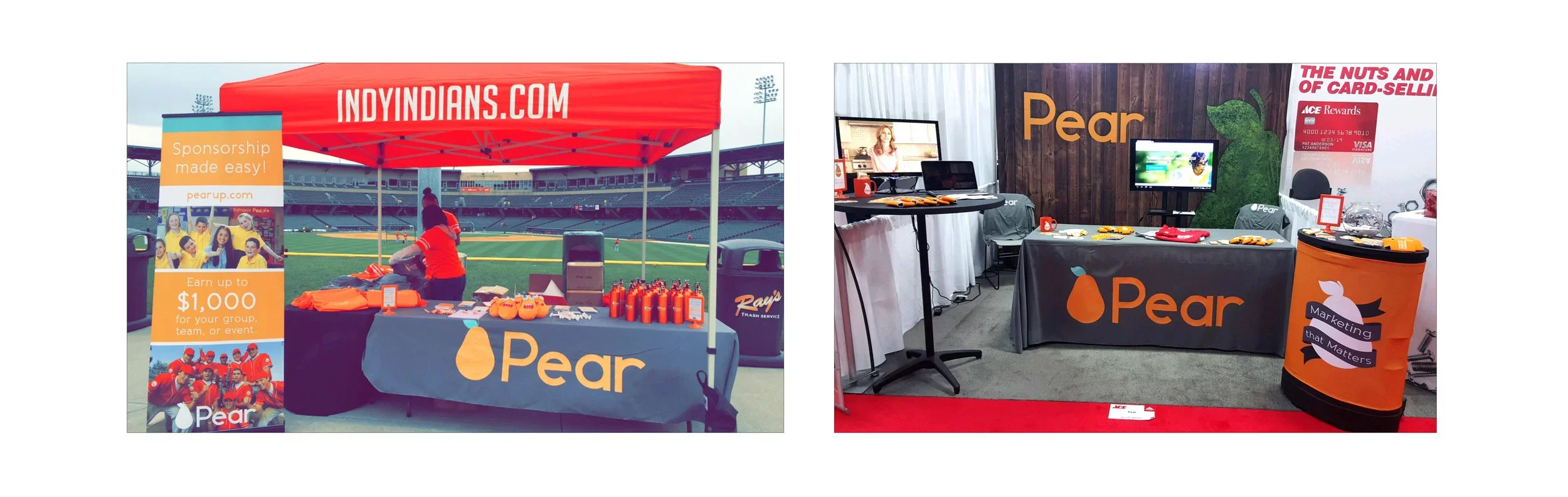
Trade shows to win over sponsors, ballparks to sign up groups. The tent, the exhibit, the banners, and the giveaways all had to hold up in bright sun and under convention-center lights.
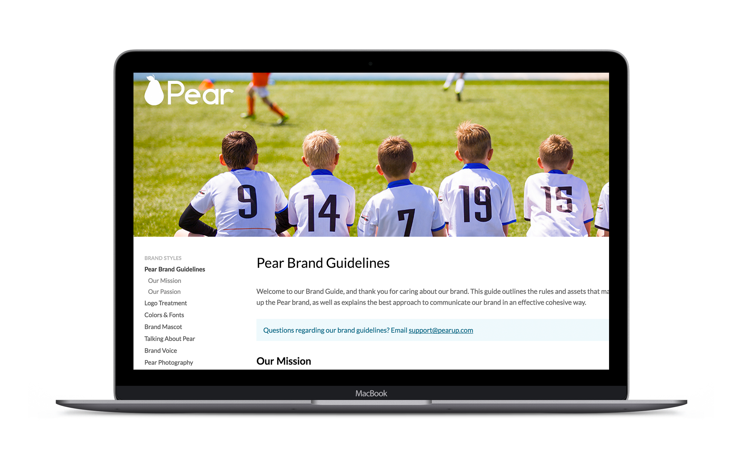
Brand guidelines site
As Pear grew, more people were making things with the logo, and not all of them were designers. I built the brand guidelines as a simple website so sales, partners, and vendors could find the mission, logo rules, colors, fonts, and photo style in one place.
A brand you could walk through
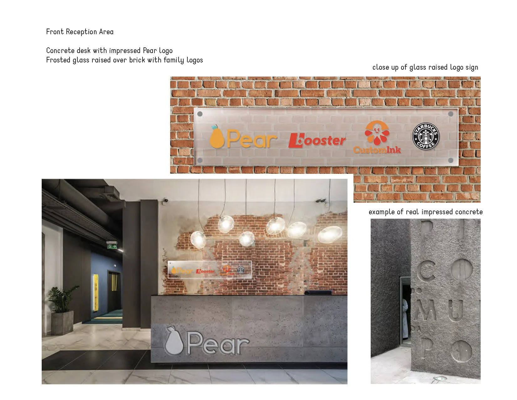
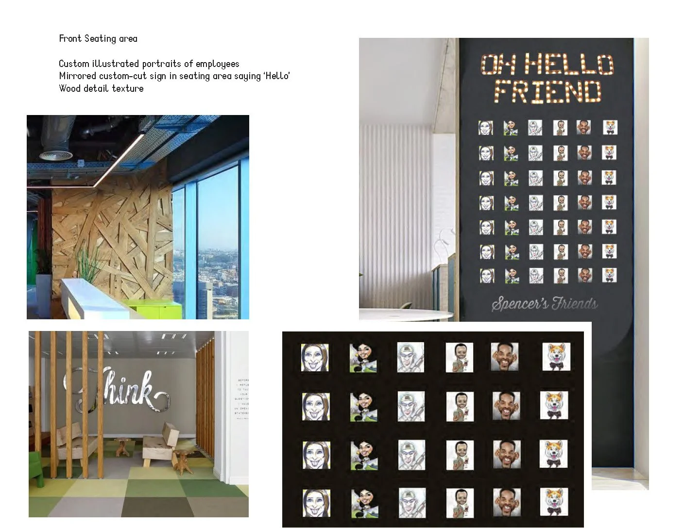
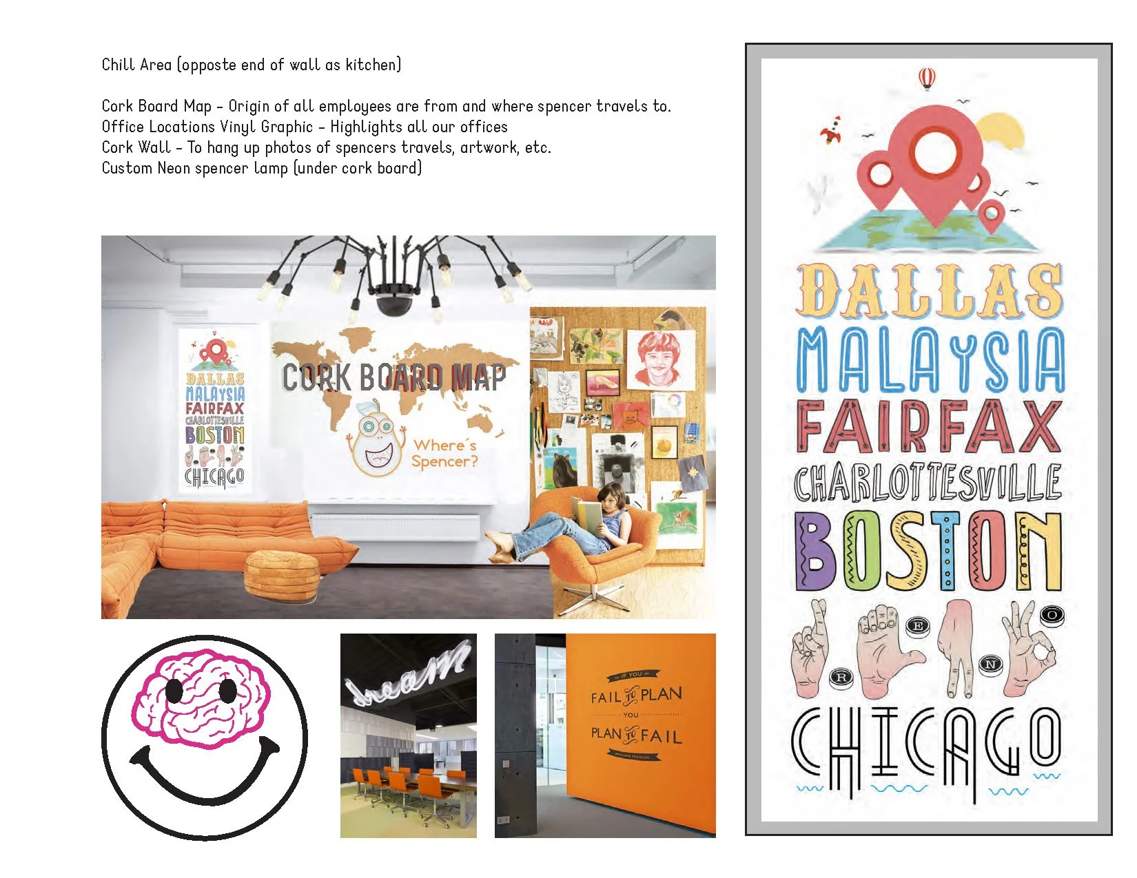
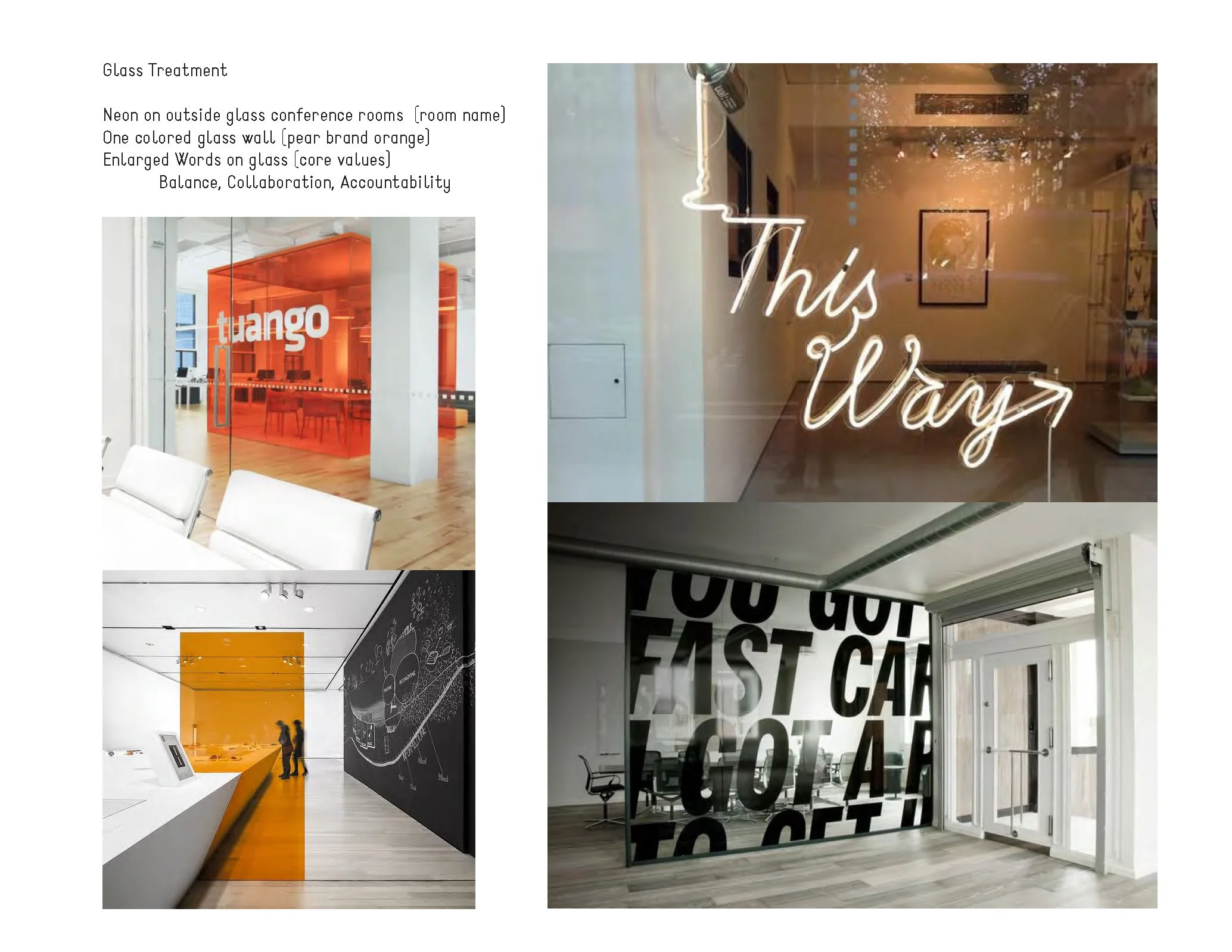
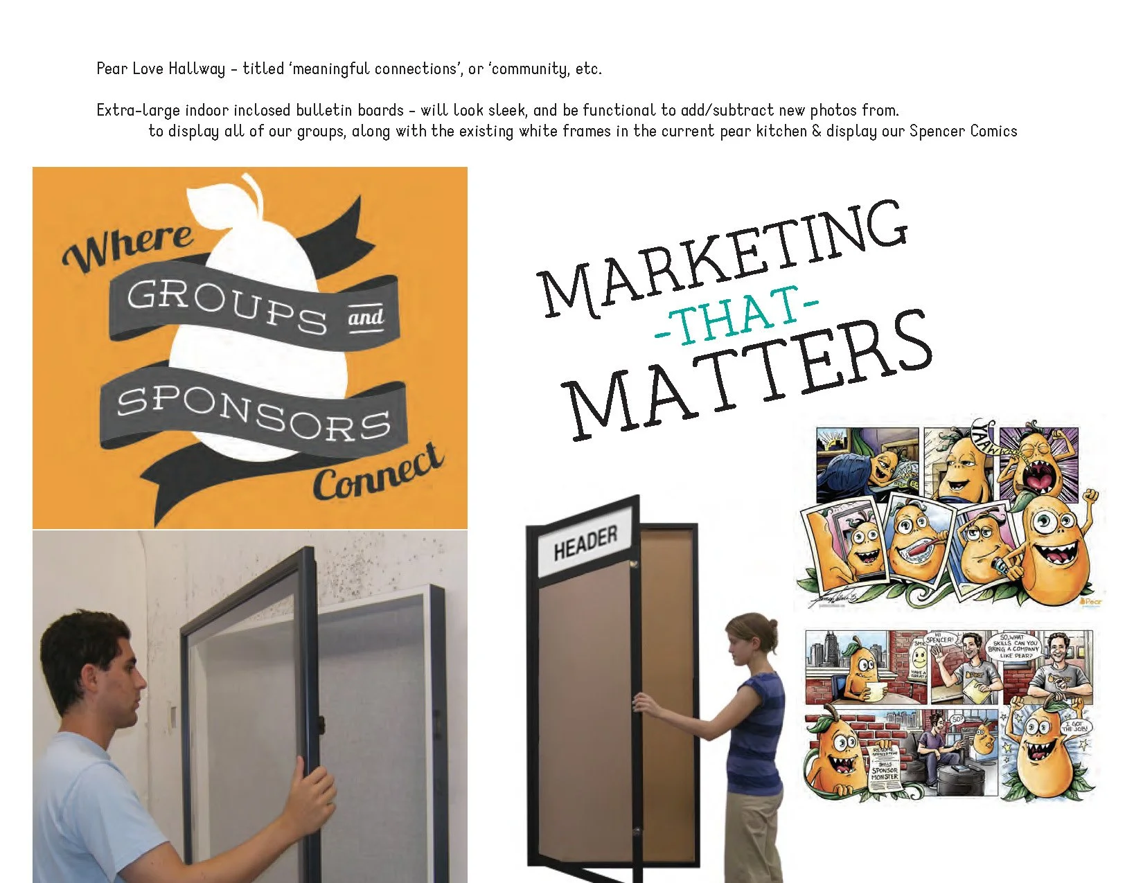
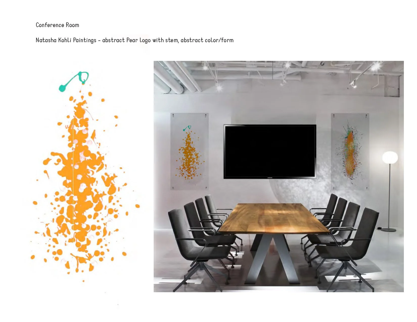
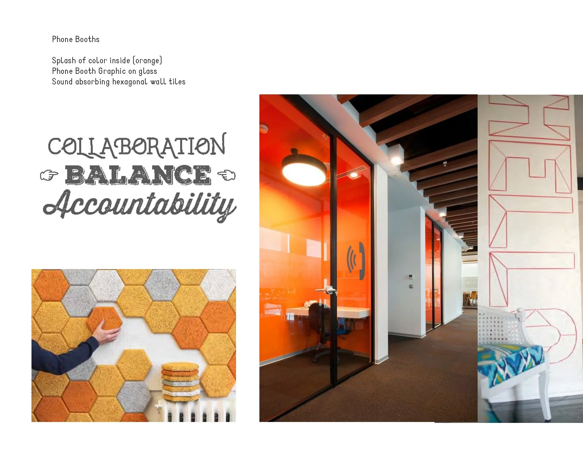
When Pear moved into a new space, I got to take the brand off the page. These concept boards map out every room: a concrete reception desk with the logo pressed in, a wall of illustrated team portraits, a hallway celebrating groups and sponsors, a splatter-painted pear in the conference room, and phone booths lined with felt.
What Pear taught me
Design for the skimmer
Nobody reads a flyer at soccer practice. If the offer didn't land in one glance, it didn't land.
One voice, two accents
Sponsors and groups heard the same brand, just tuned differently. Data and reach for one, fun and free stuff for the other.
Know where it lives
A train car, a scoreboard, and an inbox all ask for different things. Starting from the place made every piece better.
One brand, two audiences, every channel
From a quarter sheet to a train car to an inbox, the work gave Pear a voice that felt confident in a boardroom and right at home in a dugout.